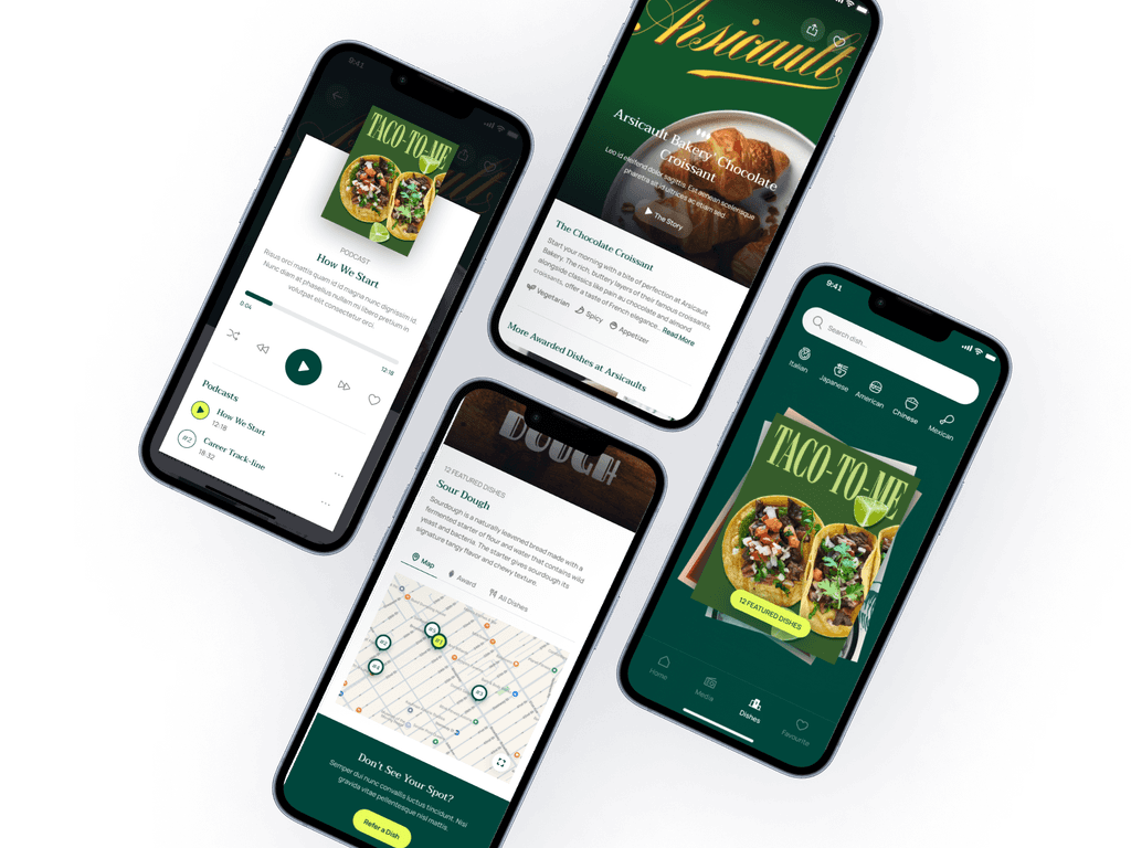
We have all searched Yelp, Google, Eater, or Infatuation just trying to satisfy a craving for a specific dish. Whenever people talk about their favorite restaurant, they really are talking about their favorite dishes that have them coming back.
However, it is nearly impossible to find a the best dish in any city right now without using the "word of mouth". I created Olla Guide to solve this problem while also trying to disrupt how most food apps are designed.
Food discovery apps typically focus on providing generalized restaurant recommendations, often overlooking the unique, individual dishes that define a restaurant's true essence. For food enthusiasts and discerning diners, finding a specific dish that embodies culinary excellence—along with the story behind it—can be challenging. This lack of dish-focused content leaves a gap for those seeking not only a meal but a memorable dining experience grounded in culture, creativity, and craft.
Olla Guide addresses this gap by curating an experience that celebrates the artistry behind standout dishes. By focusing on individual dish excellence and capturing the stories behind them, Olla Guide empowers users to discover, appreciate, and connect with remarkable food experiences in a way that traditional food apps do not.
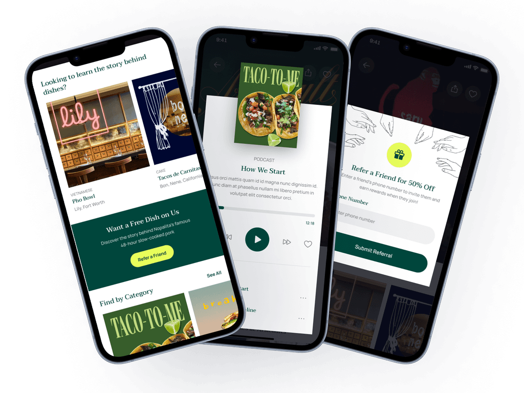
How we tried to change the way a typical food app looks.
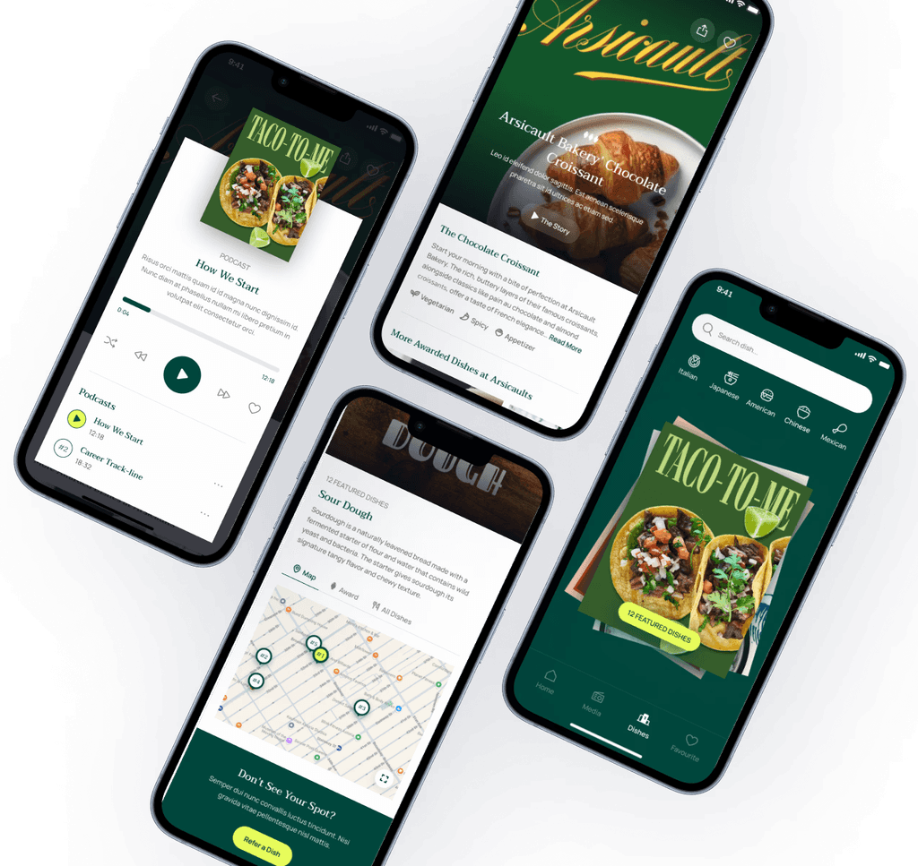
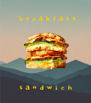
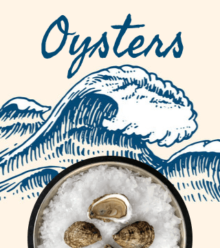
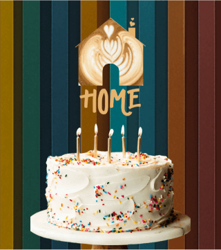
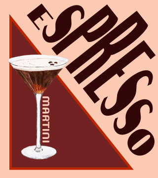
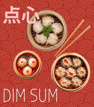
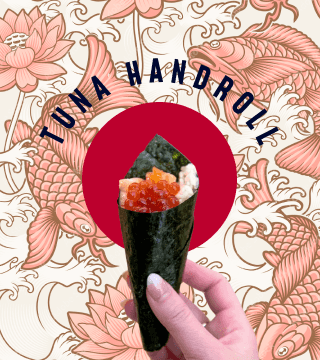
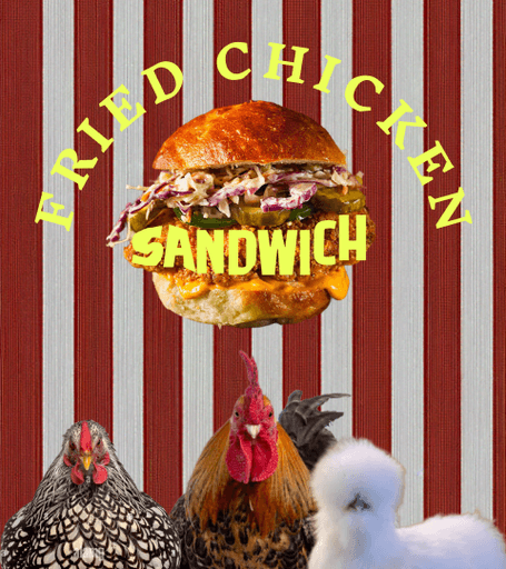
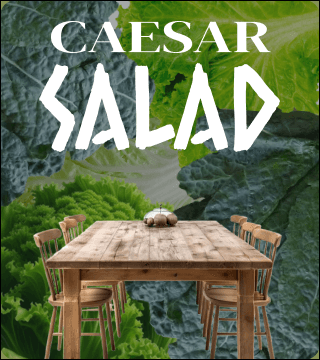
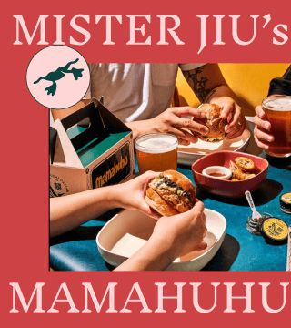
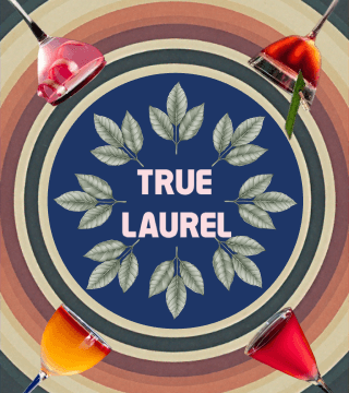
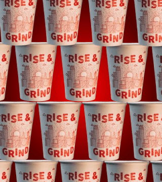
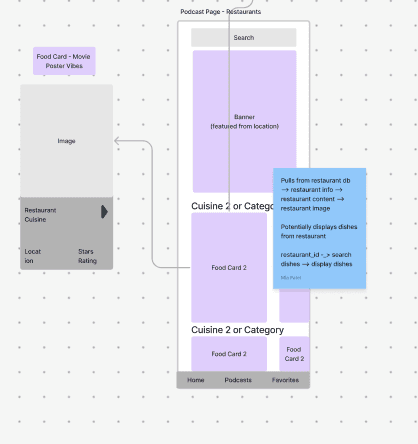
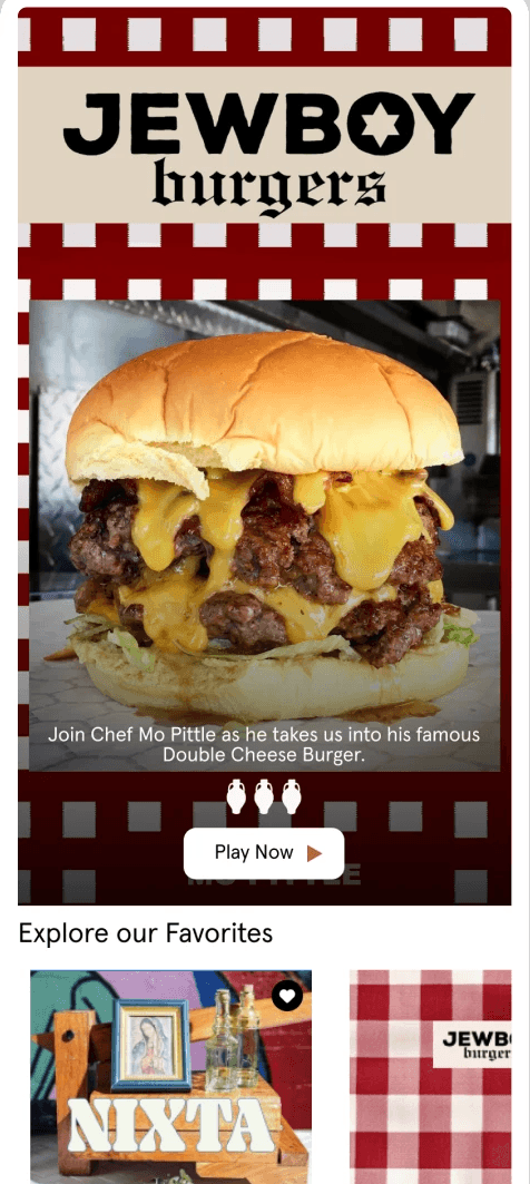
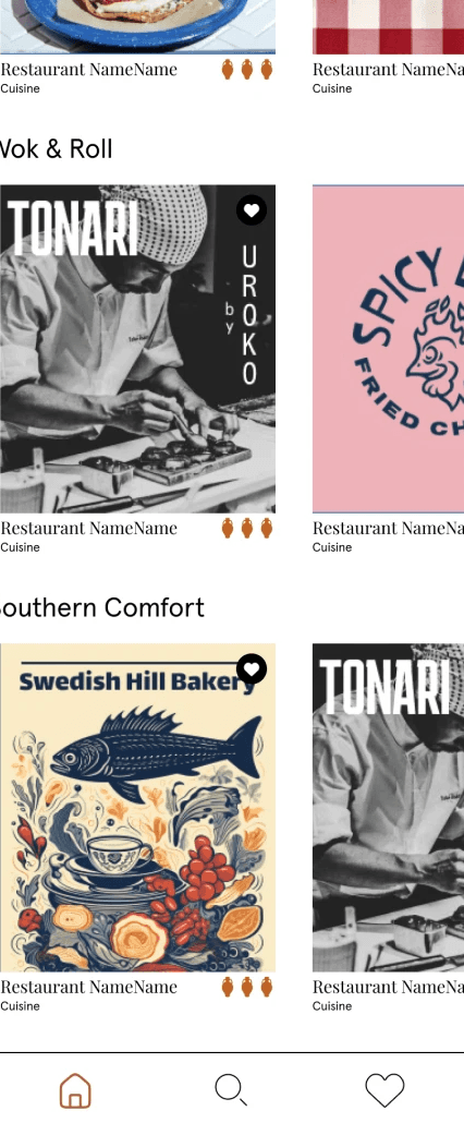
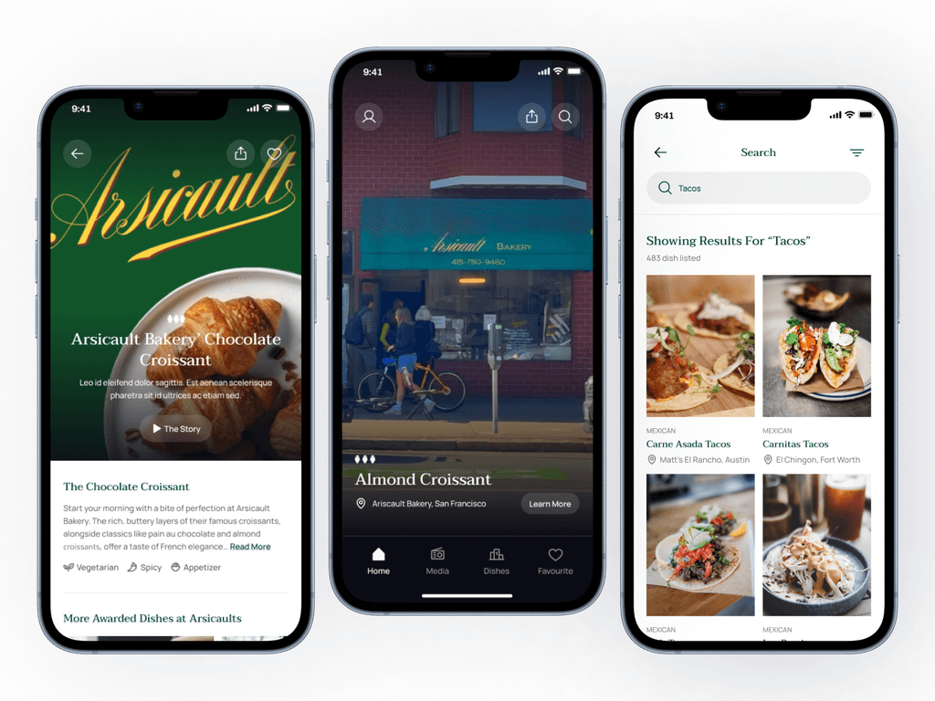
Dishes and restaurants as movie posters!
Throughout my year experience of building Olla Guide, I have gained a lot of insight into what makes a great food app. I created three user persona's to help culminate the thoughts & insights from users and restaurant owners.
My design process from start to finish. This was my first major design project, and it was so much fun to create! Through each iteration, I interviewed users (foodies and restaurants) to understand their needs and wants.
Brainstorming the Goals of Olla
Easy sign-in
Users enter the app, log in with their phone number, receive a text confirmation code, and set a password.
Home Page
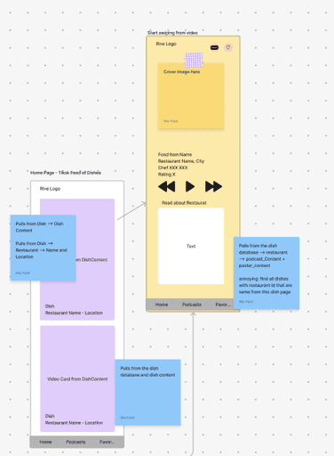
List of images and a search option to find specific dishes.
Media Page
Inspired by Streaming Platforms: Displays awarded dishes as “movie poster” style cards. Clicking a card opens the restaurant page with options for podcast, details, map, and social link.
Adding more sections based on user feedback!
Home Page
Inspiration from TikTok: We found that users actually liked viewing their food using video. This became a big differentiator compared to other food apps. Scrollable feed of 8-10 second videos showcasing awarded dishes, with a search option to find specific dishes.
Media Page
Inspired by Streaming Platforms: Displays awarded dishes as “movie poster” style cards. Clicking a card opens the restaurant page with options for podcast, details, map, and social links.
Design:
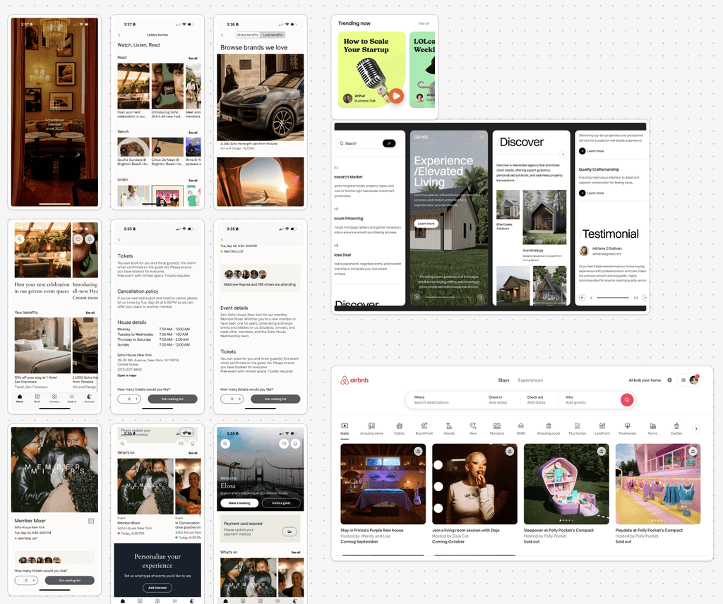
Very rough version based on user feedback and own judgement. Most dish apps feel childish so we wanted to create an app that felt more sophisticated to validate the award.
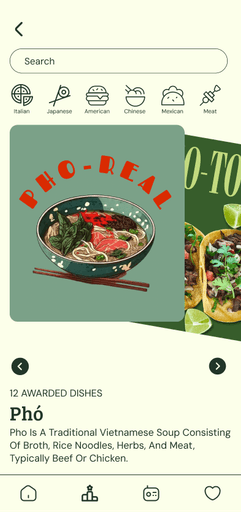
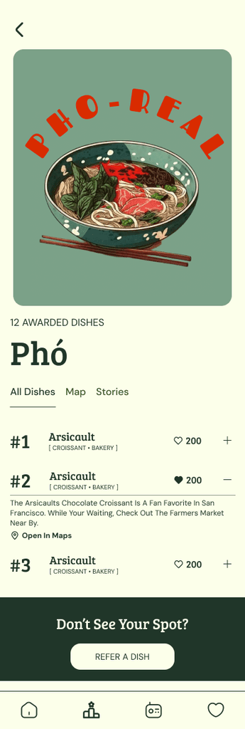
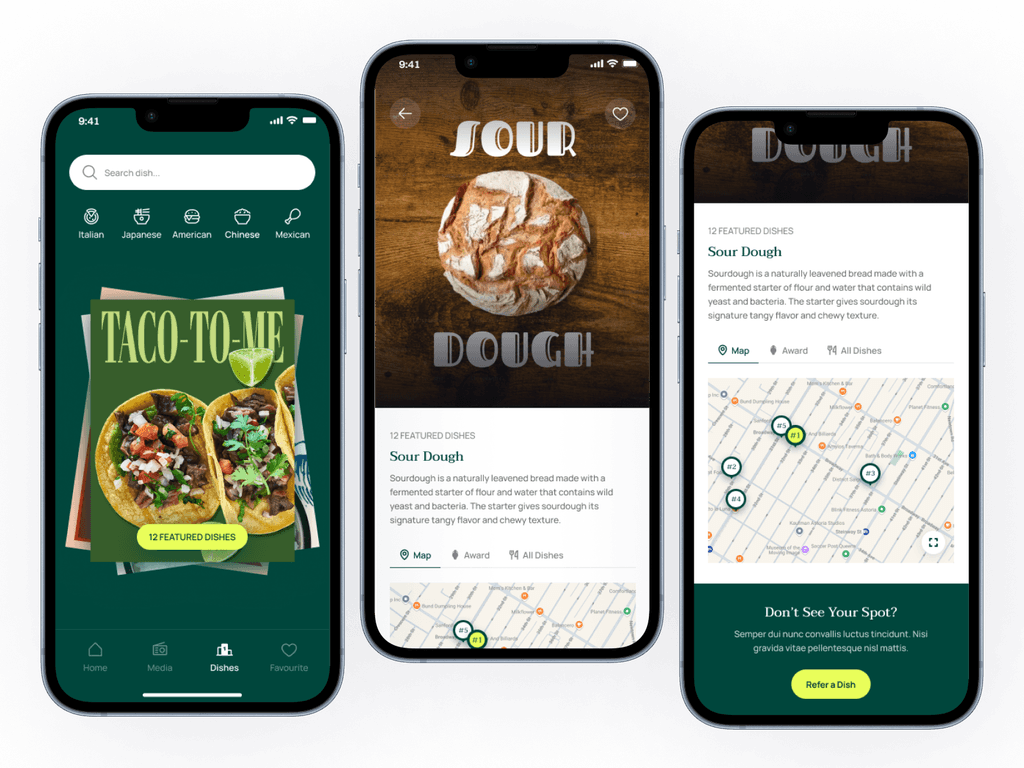
Dish Page: We introduced the Dish Page after hearing from users who wanted a comprehensive view of all available dishes. This page allows users to compare and contrast dishes with a ranking system and view top-rated dishes displayed in vibrant poster-style visuals, adding a sense of excitement and discovery to the experience
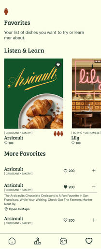
Like Feature and Like Page: Like feature and Like Page were designed to engage users by enabling them to rank their favorite dishes and contribute to a community-driven experience. By shifting the focus from purely individual choices to shared recommendations, users now feel more connected and involved. Additionally, an option to recommend dishes allows users to share their top picks with others.
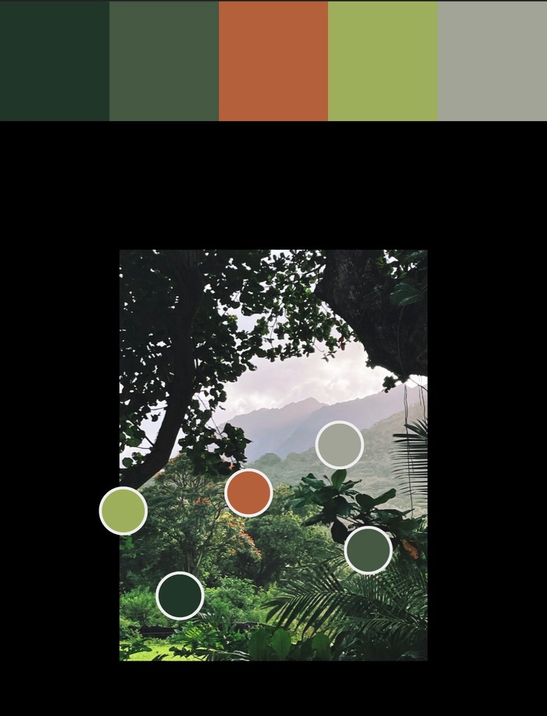
Design: User feedback suggested that the app was not excited enough. We added more graphics, color and a little bit of "fun" while keeping the sophistication

